Graphing Data
Imagine we've just finished our experiment and we're looking at a big pile of data. It's like our calculator had the stomach flu and spewed numbers everywhere. Gross.
How do we organize those data into something that isn't number vomit? That's where the graphs come in. We understand that graphs might be a sore subject for some people. Perhaps they can never get their lines straight, or they somehow always end up plotting points outside of the graph. Never fear, we're going to turn you into a graphing wizard, and we promise it will be (relatively) painless.

This line graph shows that polio cases have decreased over time. Have you thanked a vaccine today? (Source)
A good friend of the line graph is the X-Y Scatter Plot. This graph is really useful for determining if there is a positive or negative relationship between two variables (or no relationship at all). After all, it's not like we can pass them a note, asking them to check "yes" or "no".
If we're comparing things between different groups, like the number of each type of marshmallow in a box of Lucky Charms, a bar graph is the way to go.
Last, but not least, there are pie charts for those times when we need to compare parts of a whole. Or think about how much we like pie.
These four types of graphs will handle the majority of our numerical needs, but check this page out in case you come across a set of data that's a little more high maintenance.
Now that we know what type of graph our data are going into, we need to give our data a name. No, not Madelyn or Polonius. The name we choose is going to be the name of our graph, so it should describe what the data are all about. We have to remember that not everyone participated in our experiment, so we'll want to make sure the latecomers know what's going on. For something so obvious, this can be harder to remember than we like to admit.
The title goes on the top of the graph, and then we'll have to set up our axes. The horizontal x-axis is for the independent variable. This is the variable that doesn't change as a result of the experiment. Like, if our experiment measures the mass of a tomato as it decomposes over time, our independent variable would be time. Neither us, the tomato, nor the mold are going to change the amount of time that passes. This means time is independent of all the other variables.
The dependent variable is usually the variable we're measuring, or the thing we're trying to study. In the moldy tomato experiment, the dependent variable would be the mass of the tomato, because it depends on how much time has passed.
In case you're still getting weird vibes from variables, here's a crash course in figuring out what type of variable you're dealing with.
An independent variable is…
Now, we'll be the first to admit that scaling a graph is probably the trickiest part of the whole graphing process. Lucky for you, you have us to show you how to Shmoopify your scale:
Step 1: Figure out the range of data we're dealing with—that is, subtract the lowest value from the highest value.
Step 2: Figure out the amount of space we have on our axis. We'll need to count the tick marks between zero and wherever the end of the axis is so we know how much room we have to work with.
Step 3: Divide our range of data by the number of tick marks and voila! We have a scale.
Here's an example, because "voila!" isn't really helpful when it comes to math:
We have a set of data that go from 5 meters to 95 meters, so the range is 90. We have 30 tick marks on our graph. When we divide the range by the tick marks, we end up with the number 3. Each tick mark should represent 3 meters.
Don't forget that our data should fit within our graph. If we find ourselves drawing in extra rows or columns so that our data fit, then we'll need to rethink our scale. Also, each axis can have a different scale, but our scale has to stay the same all the way across each axis and into eternity. No fair changing from 3 meters to 7 meters halfway through because it's our lucky number (or because our data won't fit otherwise).
Sometimes we end up with rebellious data that aren't interested in fitting into the typical graph. Don't fret, and certainly don't delete them (that's a big science no-no). There are ways to work around it. For example, if our data start off a long way from (0, 0), the good ol' axis break tells our graph viewer that some values are missing but that they aren't really relevant, so we won't miss them.
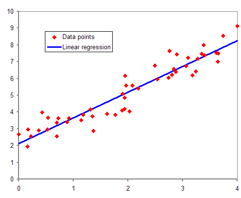
These data are totally trendy in a positive way. (Source)
If we have a really fancy graph with more than one set of data, we'll need to do something to distinguish between our data points. We can use different colors (but we'll need to keep in mind any color-blind members of our audience), or line patterns (dashed, solid, dotted), or data point types (circle, square, triangle, shaded, open). Whatever we choose, we just have to make sure to include a key so our reader knows that the orange dotted line represents the amount of food the Chihuahua ate and the blue dotted line is the amount of food the Doberman ate. Hopefully the Doberman didn't eat the Chihuahua, but that's a discussion for a different day.
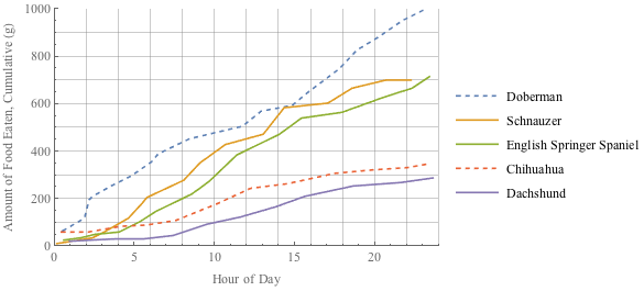
These color combos are sure to be inspiration for next year's Fashion Week.
The last thing we'll need for a rock star graph is a legend. This is basically like the Cliff Notes version of our graph. It usually has a figure number, a sentence to summarize the results and where they came from, the materials used in our experiment, and whether or not our results were statistically significant (if we used statistics). What does one of these bad boys look like? Here's an example:
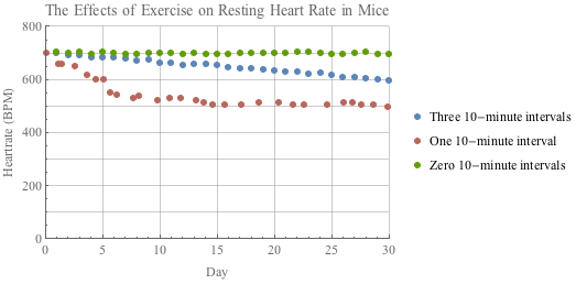
"Figure 1. The heart rate (bpm) in resting mice over a period of one month. Groups of mice were required to run on a wheel for zero, one, or three ten-minute intervals a day. Mice that were required to run for more ten-minute intervals had lower resting heart rates than those who ran for fewer ten-minute intervals."
And that's that. You now have a well-stocked graphing tool belt, so get out there and put it to use on some data.
How do we organize those data into something that isn't number vomit? That's where the graphs come in. We understand that graphs might be a sore subject for some people. Perhaps they can never get their lines straight, or they somehow always end up plotting points outside of the graph. Never fear, we're going to turn you into a graphing wizard, and we promise it will be (relatively) painless.
Graph Shopping
The first thing is to decide what kind of graph our data will call home. In general, line graphs work great for looking at how stuff changes over time. For example, if we've been measuring a giraffe's height as it grows up and we want to know when it hit a growth spurt, a line graph is just the thing.
This line graph shows that polio cases have decreased over time. Have you thanked a vaccine today? (Source)
A good friend of the line graph is the X-Y Scatter Plot. This graph is really useful for determining if there is a positive or negative relationship between two variables (or no relationship at all). After all, it's not like we can pass them a note, asking them to check "yes" or "no".
If we're comparing things between different groups, like the number of each type of marshmallow in a box of Lucky Charms, a bar graph is the way to go.
Last, but not least, there are pie charts for those times when we need to compare parts of a whole. Or think about how much we like pie.
These four types of graphs will handle the majority of our numerical needs, but check this page out in case you come across a set of data that's a little more high maintenance.
Now that we know what type of graph our data are going into, we need to give our data a name. No, not Madelyn or Polonius. The name we choose is going to be the name of our graph, so it should describe what the data are all about. We have to remember that not everyone participated in our experiment, so we'll want to make sure the latecomers know what's going on. For something so obvious, this can be harder to remember than we like to admit.
Setting Up Shop
Next step: setting up the graph. We'll need a nice cozy place for those data to call home. If we're doing things the old-fashioned way, our graph should ideally be set up on graph paper and should take up as much of the page as possible. We aren't presenting our data to a colony of ants, so make it readable to a slightly nearsighted human. If pencil and paper are so not your thing, there are a ton of computer-based graphing resources you can use instead. We've compiled a few in the Best of the Web section as an early birthday present to you. You're welcome.The title goes on the top of the graph, and then we'll have to set up our axes. The horizontal x-axis is for the independent variable. This is the variable that doesn't change as a result of the experiment. Like, if our experiment measures the mass of a tomato as it decomposes over time, our independent variable would be time. Neither us, the tomato, nor the mold are going to change the amount of time that passes. This means time is independent of all the other variables.
The dependent variable is usually the variable we're measuring, or the thing we're trying to study. In the moldy tomato experiment, the dependent variable would be the mass of the tomato, because it depends on how much time has passed.
In case you're still getting weird vibes from variables, here's a crash course in figuring out what type of variable you're dealing with.
An independent variable is…
- also called the "explanatory variable"
- the cause, if we're looking at cause and effect
- a variable that's different with each trial, but not the one that's being measured
- time (it's totally out of our control)
- also called the "response variable"
- the effect, if we're looking at cause and effect
- a variable that gets measured in an experiment
Don't Skip the Scale
The next part is figuring out a scale for each axis. Finding the right scale is like finding the right pair of shoes. Our feet should fit in them comfortably, they shouldn't be too big or too small, and they should offer proper arch support. Uh, okay, our data can probably do without the arch support, but they do need to fit comfortably in the graph we've set up; otherwise that number vomit we've been trying to organize is just going to turn into an even bigger mess.Now, we'll be the first to admit that scaling a graph is probably the trickiest part of the whole graphing process. Lucky for you, you have us to show you how to Shmoopify your scale:
Step 1: Figure out the range of data we're dealing with—that is, subtract the lowest value from the highest value.
Step 2: Figure out the amount of space we have on our axis. We'll need to count the tick marks between zero and wherever the end of the axis is so we know how much room we have to work with.
Step 3: Divide our range of data by the number of tick marks and voila! We have a scale.
Here's an example, because "voila!" isn't really helpful when it comes to math:
We have a set of data that go from 5 meters to 95 meters, so the range is 90. We have 30 tick marks on our graph. When we divide the range by the tick marks, we end up with the number 3. Each tick mark should represent 3 meters.
Don't forget that our data should fit within our graph. If we find ourselves drawing in extra rows or columns so that our data fit, then we'll need to rethink our scale. Also, each axis can have a different scale, but our scale has to stay the same all the way across each axis and into eternity. No fair changing from 3 meters to 7 meters halfway through because it's our lucky number (or because our data won't fit otherwise).
Sometimes we end up with rebellious data that aren't interested in fitting into the typical graph. Don't fret, and certainly don't delete them (that's a big science no-no). There are ways to work around it. For example, if our data start off a long way from (0, 0), the good ol' axis break tells our graph viewer that some values are missing but that they aren't really relevant, so we won't miss them.
Plotting: It's Not Just For Villains Anymore
We've now set up a stunning graph that any data would be proud to call home. Now we've just got to get those data moved in, so it's time to start plotting our points or drawing our bars. We'll want to connect those dots if we're doing a line graph, and if we're doing an X-Y scatter plot we'll want a line of best fit to show the general trend in the data. It doesn't need to touch all of the data points, but should give the graph viewer the general gist of the direction the data are going.
These data are totally trendy in a positive way. (Source)
If we have a really fancy graph with more than one set of data, we'll need to do something to distinguish between our data points. We can use different colors (but we'll need to keep in mind any color-blind members of our audience), or line patterns (dashed, solid, dotted), or data point types (circle, square, triangle, shaded, open). Whatever we choose, we just have to make sure to include a key so our reader knows that the orange dotted line represents the amount of food the Chihuahua ate and the blue dotted line is the amount of food the Doberman ate. Hopefully the Doberman didn't eat the Chihuahua, but that's a discussion for a different day.

These color combos are sure to be inspiration for next year's Fashion Week.
The last thing we'll need for a rock star graph is a legend. This is basically like the Cliff Notes version of our graph. It usually has a figure number, a sentence to summarize the results and where they came from, the materials used in our experiment, and whether or not our results were statistically significant (if we used statistics). What does one of these bad boys look like? Here's an example:

"Figure 1. The heart rate (bpm) in resting mice over a period of one month. Groups of mice were required to run on a wheel for zero, one, or three ten-minute intervals a day. Mice that were required to run for more ten-minute intervals had lower resting heart rates than those who ran for fewer ten-minute intervals."
And that's that. You now have a well-stocked graphing tool belt, so get out there and put it to use on some data.