ShmoopTube
Where Monty Python meets your 10th grade teacher.
Search Thousands of Shmoop Videos
Charts, Graphs, and Tables Videos 60 videos
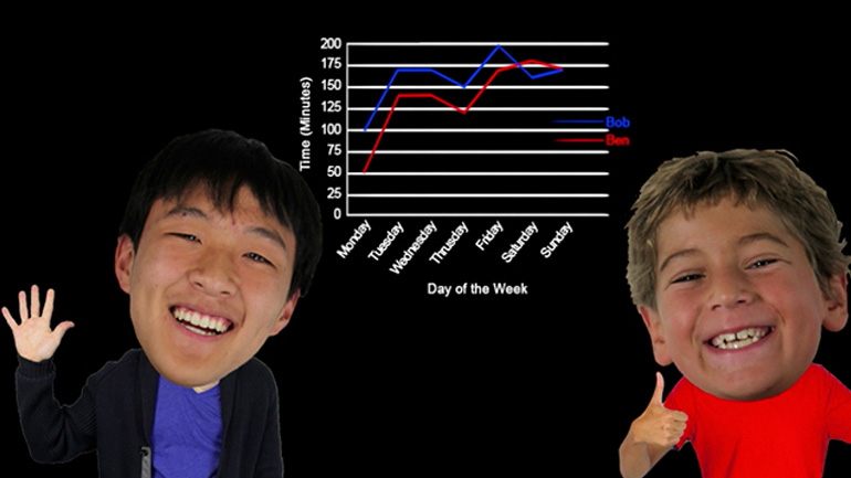
Statistics, Data, and Probability II Drill 1, Problem 2. Based on the chart, which of the following statements is true?
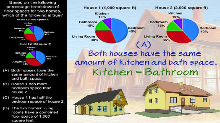
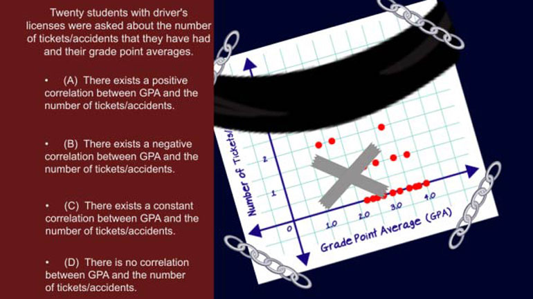
CAHSEE Math Statistics, Data, and Probability II: Drill Set 1, Problem 3. Based on the following, which of the following statements is true?
CAHSEE Math 5.5 Statistics, Data, and Probability II 200 Views
Share It!
Description:
Statistics, Data, and Probability II Drill 5, Problem 5. If Bert purchased $15,000 in merchandise at wholesale prices, how much would he need to make in total sales to earn a 12% profit?
Transcript
- 00:03
Here’s a question to put a little shmoop in your step…
- 00:06
For the past few years, the owners of a local baseball team, the Fighting Pansies, have
- 00:10
been trying to increase slumping attendance by lowering ticket prices.
- 00:14
Twitter feedback indicates that the biggest barrier to ticket sales is the high cost of the ticket.
- 00:20
No one wants to pay through the roof to watch a bunch of Pansies play baseball.
Full Transcript
- 00:24
If a scatter plot were used here, horizontal values on it could represent the ever-higher
- 00:29
markdowns in ticket prices each year with respect to the original prices.
- 00:35
On the other hand, vertical values could represent the percentage increase in average attendance
- 00:40
per game starting from the beginning of the ticket price reductions.
- 00:44
Based on the above description, which of the following would be the most accurate statement
- 00:49
about the scatter plot representing this situation?
- 00:52
And here are the potential answers...
- 00:57
OK, so this long, hairy question is asking us to interpret a scatter plot… without providing us a scatter plot.
- 01:04
In other words… if WE were in charge of converting the given information into a scatter
- 01:08
plot… how on Earth would we do it?
- 01:10
Well, the problem tells us we should show
- 01:12
the discounted ticket prices along the horizontal, or x-axis…
- 01:17
…and the vertical, or y-axis, should show the percentage of increase in attendance.
- 01:22
If we were to put together such a plot, like this…
- 01:24
...with attendance going up as discounts go up…
- 01:27
…we’d have a POSITIVE correlation, since our plotted points move in an upward direction
- 01:31
from left to right.
- 01:33
Be careful here…
- 01:34
…if we were to compare attendance with ticket PRICES, we’d have a negative correlation…
- 01:38
…but because we’re asked to put the DISCOUNTS along the x-axis,
- 01:42
we actually do wind up with a positive correlation.
- 01:47
So our answer is A.
- 01:49
As in, “All-star.”
Related Videos
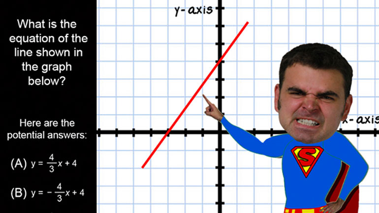
CAHSEE Math: Algebra and Functions Drill 5, Problem 3. Solve the equation.
Statistics, Data, and Probability I: Drill Set 3, Problem 4. How many different avatars can be created based on the given options?
Statistics, Data, and Probability II Drill 3 Problem 2. Which two sports together make up for the preferences of more than half of all those w...
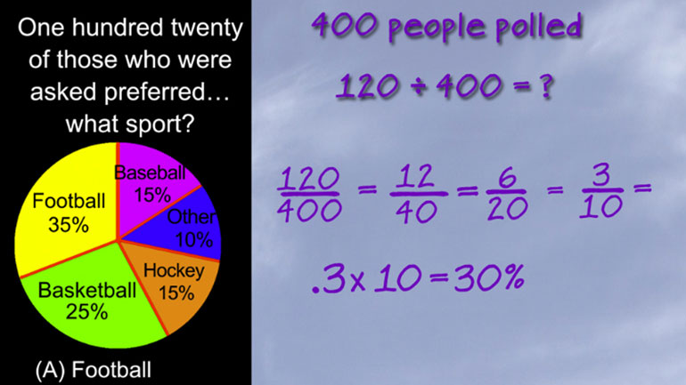
Statistics, Data, and Probability II Drill 3 Problem 3. One hundred twenty of those who were asked preferred what sport?


